Collage Experiments: Part 2
- ellenlouise
- Dec 28, 2020
- 3 min read
I found this difficult when I first had a go a creating these collages as I didn't have a brief to work on and very little images at my disposal. With little direction, I attempted to collage but was not proud of the results.

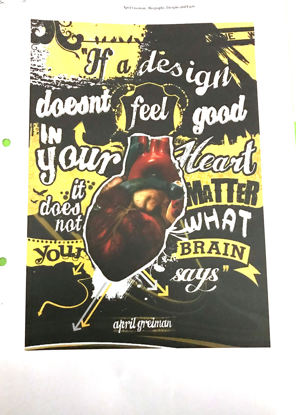
I started, as a warm-up, using the collage I had already made with Greiman's work. I was just experimenting with type to see how I could manipulate the layout of the letters. I still wanted the audience to be able to read what was said but it would take a little bit of work do to how I chose to try a more playful way of laying out the type. The outcome is not something I am particularly proud as I didn't spend much time on it, as it was just a warmup. However, I found this one easier to work with because I knew what I was trying to say.

The second one was with the message 'home is where the heart is' I chose to keep in the ripped edge of where it was torn out of the magazine. This is was from a full-page spread and I chose to only take the window aspect of the image. The collage itself is not particularly subversive as the message and the imagery line up. However, the combination of the different elements makes it subversive within my practice. This mixed media approach is something I wouldn't normally use and is more subversive compared to traditional methods of graphic design. The elements in question are; the torn out magazine page, digital typography and a pen drawn doodle of a heart. I haven't used a huge mixture of elements however the message can still be understood.

The 'is seeing believing' piece was me attempting to question a message that is used, that message being seeing is believing. My goal would be to get the audience to question what they see. I struggle with what to use to match the message so went with a magazine page where the face has been torn away. I layered some colour over the top and dropped the opacity to further obstruct the image behind. The image itself is a bit blurry as it was not the sole focus of the spread. 'Is seeing' is hidden behind the colour overlay while believing is positioned on top in clear view. I also chose to experiment with the typography and use two very different fonts. Greiman plays with font size, spacing and placement but I wanted to adapt my font choice as I would normally avoid something like this.

The 'all you need is revolution piece' is adapting the messaging all you need it, love. I included thinks that we link to love like a rose, the colour pink and beautiful calligraphy. The little pink post it is supposed to be like a little love letter, beautifully hand-lettered. I wanted to use a font that looks like painted letters for revolution but to add the love aspect reused my heart to replace some letters.

Following on from 'is seeing believing' I wanted to try something with the eyes I had taken from the magazine. I repeated the image with the caption 'what do I see'. I wanted to add a discomfort the letters so it felt those words might have a deeper more sinister meaning so I went for a ransom, not style font. The mismatch of letterforms would hopefully create a small discomfort in the audience when reading.

The final one I did was on Portsmouth. I took the postcard images I photography and overlayed with some of my watercolour shapes. For this piece, I just wanted to experiment with layering different things and seeing how it worked.
Overall none of these works are finished pieces. However, I think if I had a direction maybe I could use them as a starting point. The task forced to think in a way I wouldn't normally. With no brief and some random materials, I forced myself to create something and within these, even though I am not proud of the outcomes, I have found messages I could portray, played with typography and come with ideas on the spot.


Comments